Loading content
Component Library
Thirty components, one calm system
Every component below is built from the same design tokens, motion presets and layout primitives — so they compose cleanly and adapt to light and dark automatically. Use the theme toggle to see it live.
Cards
Composable surface with header, content and footer slots.
Interactive card
Lifts gently on hover using the motion presets.
Built on shared tokens so it adapts to light and dark automatically.
Muted tone
An alternate recessed surface.
Use for secondary information.
Elevated
Larger shadow for emphasis.
Four elevation levels available.
Modal
Portalled, focus-trapped, scroll-locked and Escape-to-close.
Accordion
Accessible disclosure with animated height.
A cohesive design system and component library built on a single set of design tokens.
Tabs
Shared animated indicator with roving-tabindex keyboard support.
A restrained, editorial aesthetic inspired by Scandinavian design.
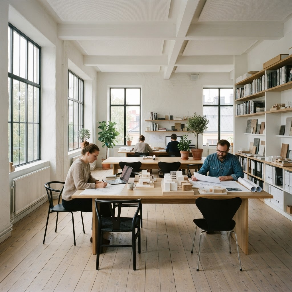
Hero
Split layout with staggered entrance motion.
Architecture & Interiors
Considered spaces for calmer living
We design light-filled, enduring interiors rooted in Scandinavian principles of simplicity and craft.
Call to action
Conversion banner with three brand tones.
Ready to shape your space?
Book an introductory call and let's talk through your ideas.
Feature cards
Icon-led grid with staggered scroll reveal.
Considered detail
Every junction and material is resolved with care.
Sustainable by default
Low-impact materials and energy-conscious design.
Light-first
We design around natural light and the changing seasons.
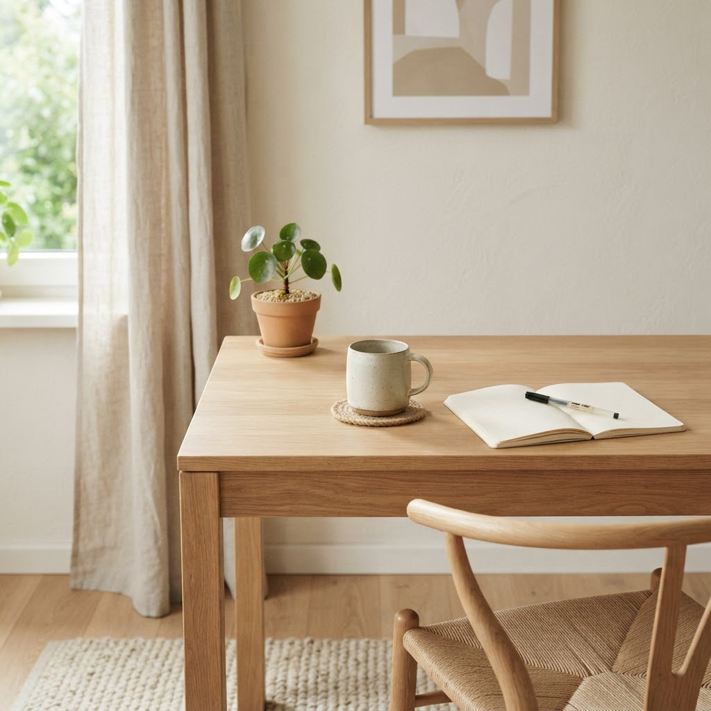
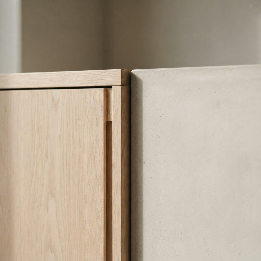
Service cards
Image-led cards with hover zoom and overlay tags.
Pricing
Monthly/annual toggle with a highlighted recommended tier.
MonthlyAnnual (save 20%)
Consult
A single discovery session.
$0/mo
- 60-minute call
- Written summary
- Next-step guidance
Most popular
Studio
For a full project engagement.
$320/mo
- Concept & schematic
- Material palette
- 3D visualisation
- Site visits
Bespoke
End-to-end delivery.
$640/mo
- Everything in Studio
- Contractor liaison
- Bespoke joinery
- On-site direction
Statistics
Counts up when scrolled into view.
0+
Projects delivered
0
Years in practice
0
Design awards
0%
Client retention
Testimonials
Grid of quote cards, or a single rotating carousel.
They understood our home before we did. Every room now feels effortless.
I
Ingrid Sørensen
Homeowner, Bergen
Partners
Trusted-by wordmarks as a grid or looping marquee.
Fjord
Aurora
Birch & Stone
Nordlys
Saga
Hald
Fjord
Aurora
Birch & Stone
Nordlys
Saga
Hald
Team
Portrait grid with social links that reveal on hover.



Gallery
Image grid with an accessible keyboard-navigable lightbox.
Before / After
Draggable comparison slider, keyboard accessible.
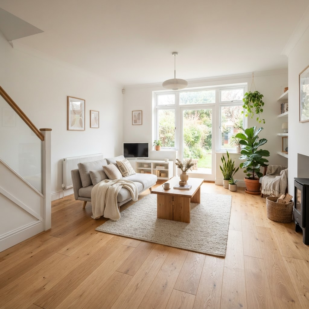 After
After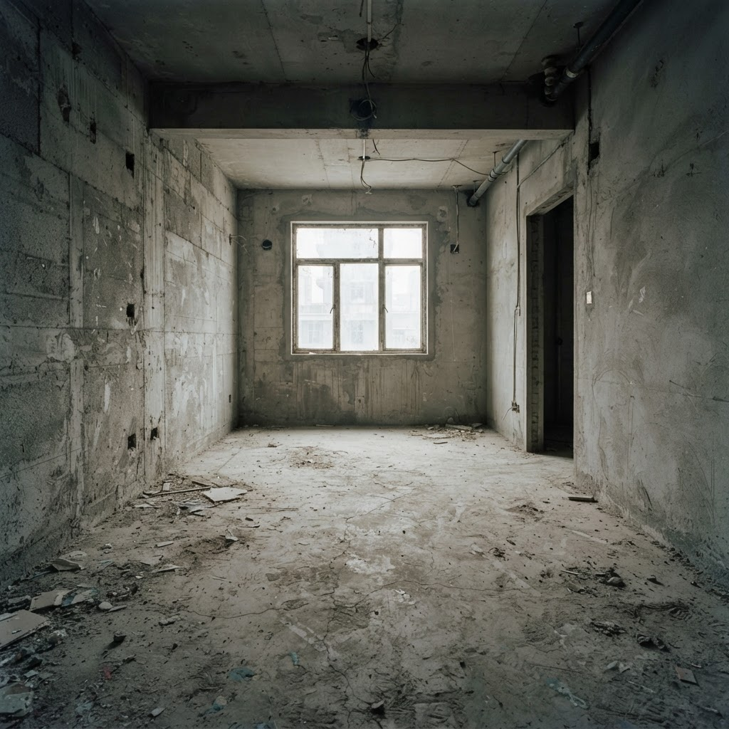 Before
FAQ
Question/answer pairs built on the accessible accordion, with matching FAQPage JSON-LD for rich results.
Timeline
Sequential process steps that reveal on scroll.
- 01
Discovery
We listen, measure and understand how you use the space.
- 02
Concept
Sketches, mood and material direction take shape.
- 03
Design
Detailed drawings, visualisation and specification.
- 04
Delivery
On-site direction through to a considered handover.
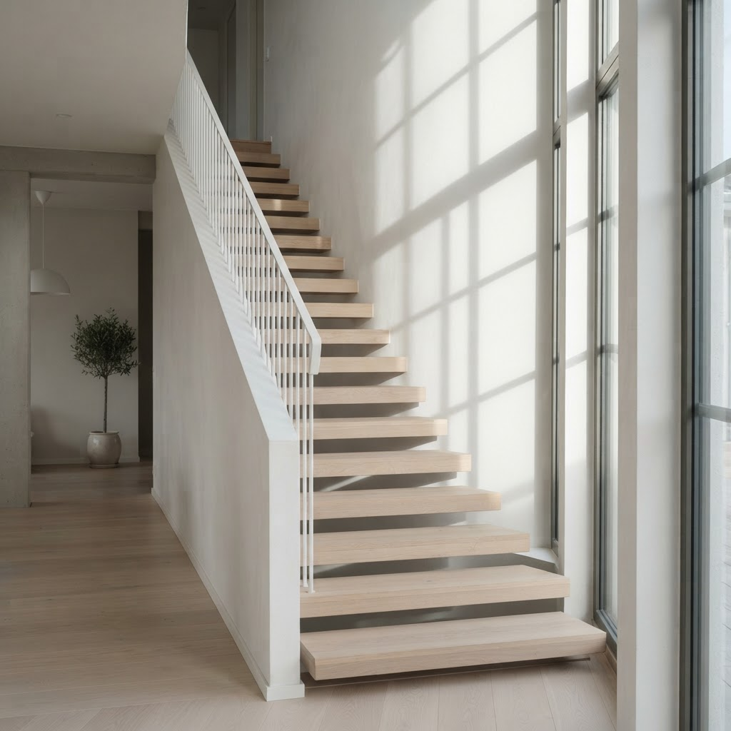
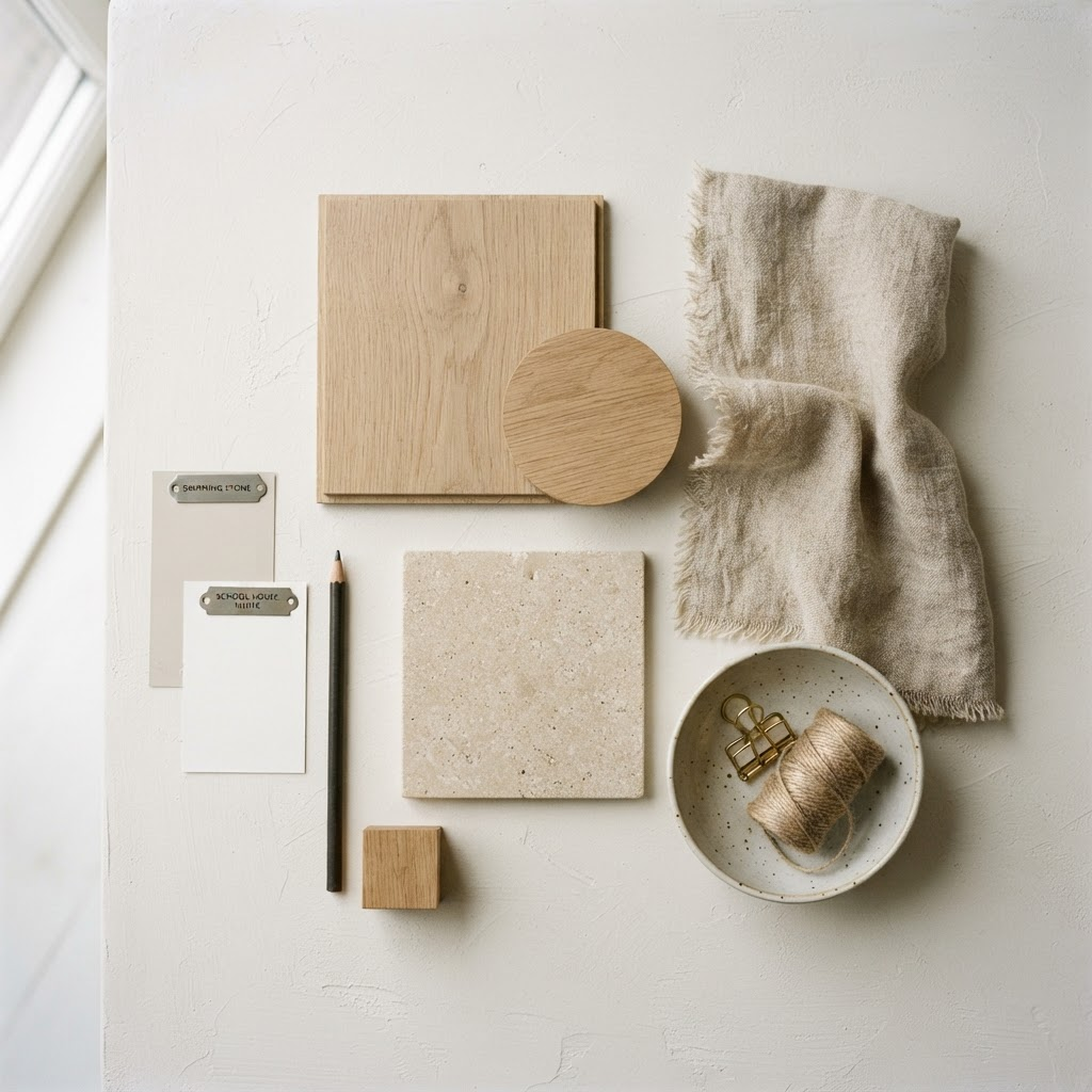
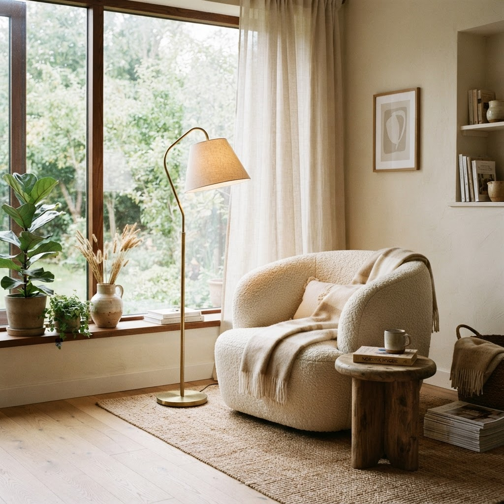
Blog cards
Article grid with an oversized featured lead card.
Google Map
Embedded, lazy-loaded map with a location overlay card.
Contact form
Per-field validation with an animated confirmation panel.
Floating actions
Booking, call and an expandable contact cluster. Toggle them below — they anchor to the screen corners.
Select an option to display a floating action.